A few months ago, a job recruiter warned me that a job listing was in a “red state,” eventually clarifying that an
increasing number of applicants were refusing to consider moving to states with a strong Republican lean.
While there are numerous valid personal reasons1 for this, the bluntness surprised me and made me curious
precisely how much quality of life varies with the political leaning of a state.
To be clear, none of the conclusions here prove a causal relationship. The focus is on a broad comparison based on
the recruiter’s simple “red state vs. blue state” framework.
Significant trends, in order of statistical significance#
When values are aggregated from lower-level metrics, we split the hierarchy into high-level, mid-level, and low-level
metrics. This hierarchy helps us understand the broader trends while also allowing us to zoom in on specific areas of
interest.
Below, we present the strength of the statistically significant2 trends as explained by political party lean
alone. Later, we’ll show plots that demonstrate a large fraction of these trends remain significant even after
correcting for differences in state wealth (measured by per capita GDP) and population density.3
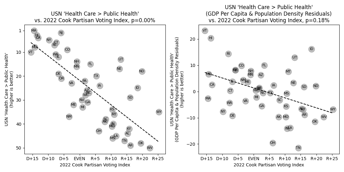
(Click to zoom) This plot shows a strong negative correlation between Republican voting patterns and public
health metrics, even after adjusting for GDP and population density.
There are too many significant trends to list here, so we only highlight those with minimal overlap with previous
higher-level categories. All trends can be viewed in the dropdown selector in the next section.
Here, we provide a hierarchical view of every plot. Use the dropdown menu to explore various quality of life metrics
and see how they correlate with political party strength.
The WalletHub (“WH”) happiness scores have two layers of hierarchical information, while the US News (“USN”) quality of
life categories have three layers of metrics.
The 16 metrics that are significantly better in Republican states are marked “[R]” and the 43 metrics that are
significantly better in Democratic states are marked “[D]”.
Select metric to plot
(Click to zoom) Left: Plot of a quality of life metric versus the 2022 Cook Partisan Voting Index, as selected
by the dropdowns above. Right: a plot of the same data after removing the portion of the overall trend that can be
explained by differences in state per capita GDP and population density. Statistically significant trends are denoted
by a black dashed line.
The 2024 US News Best States Rankings at all levels of their
hierarchy: (high-level) categories, (mid-level) category attributes, and (low-level) category attribute metrics.
The U.S. Centers for Disease Control and Prevention
2020 States Life Tables
Reproductive and LGBT rights immediately come to mind as unequivocal deal-breakers for many individuals.
Similarly, I know a number of teachers who refuse to consider Republican states due to increasing attacks on education
in general. ↩︎
Here and in the later plots, we’re using a significance level of \( \alpha =
0.05 \), Benjamini-Hochberg corrected
for the large number of multiple comparisons. This effectively controls the false discovery rate without inflating the
likelihood of false positives and ends up being equivalent to taking a per-trend significance level of \( \alpha
\approx 2.1\% \). ↩︎
Almost all the metrics analyzed here are already quoted on a per-capita basis, so correcting for population
density effects is more appropriate than population alone. Technically speaking, we actually correct against log
population density in order to
address heteroscedasticity in the data. ↩︎
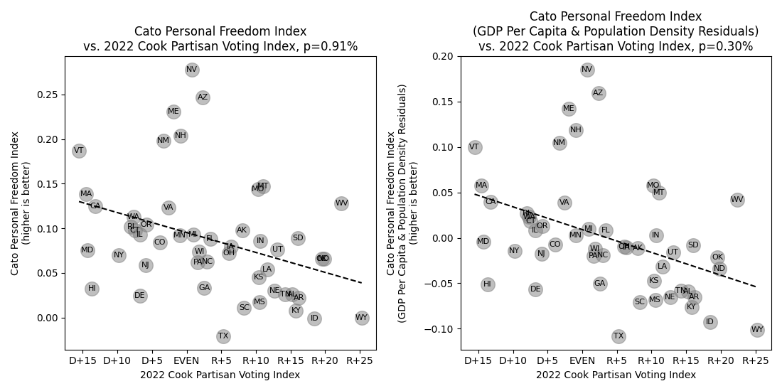
It might be surprising on the surface that Republican states have significantly fewer personal freedoms than
Democratic ones, but as the Cato Institute explains, “socially conservative states tend to restrict alcohol, gambling,
marijuana, and, until Obergefell v. Hodges, marriage freedoms.”
Other examples include some GOP charters striving to require proof of fault for all divorces and aiming to repeal
the Voting Rights Act of 1965. ↩︎
This was actually somewhat difficult since their official methodology and every source I could find are ambiguous
and/or misleading on the precise calculation. What they’re actually doing is
Tabulate per-state vote counts for the Republican and Democratic candidates.
Calculate the percentage that voted Republican/Democratic out of those that voted for either party. So, a
state that votes 45% Republican / 50% Democratic gets normalized to ~47.4% Republican / ~52.6% Democratic.
Compare this to the same nation-wide calculation, again normalizing the percentage by ignoring all third-party
voters. This uses the total votes for each party’s candidate across the entire country rather than an
aggregation of the states’ results. I.e., the comparison is to the “average voter”, not the “average state”.
Subtract the per-state and nation-wide party leans and report the final index as the 75% / 25% weighted average
of the last two presidential elections.
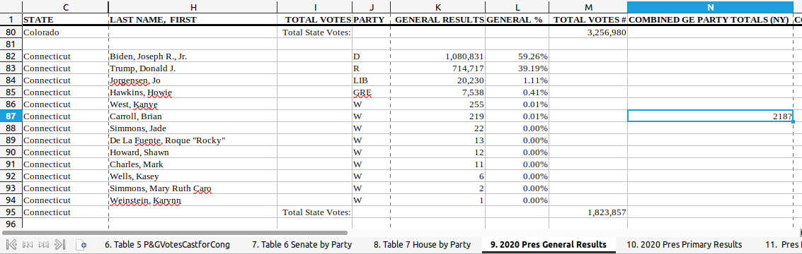
As a humorous aside, the official U.S. Excel export for the 2020 results have an overlooked note to
double-check one of the vote counts in Connecticut (placed in a column that should be blank for that state). It seems
they officially tabulated 219 votes for some minor candidate, but wanted to double-check if the actual count was 218?
Indeed, the government site for the Connecticut Secretary of State
claims 218 votes here, so the discrepancy appears real.↩︎
What is the optimal amount to spend on a computer? How often should its components be upgraded? We review historical data to build a plausible model of PC performance over time.